Brand Development
A brand is more than a logo, it’s a strategic system that defines how a company shows up in the world. It reflects values, clarifies positioning, and creates alignment across every touchpoint. When executed thoughtfully, branding becomes a competitive advantage. Driving recognition, trust, and long-term growth.
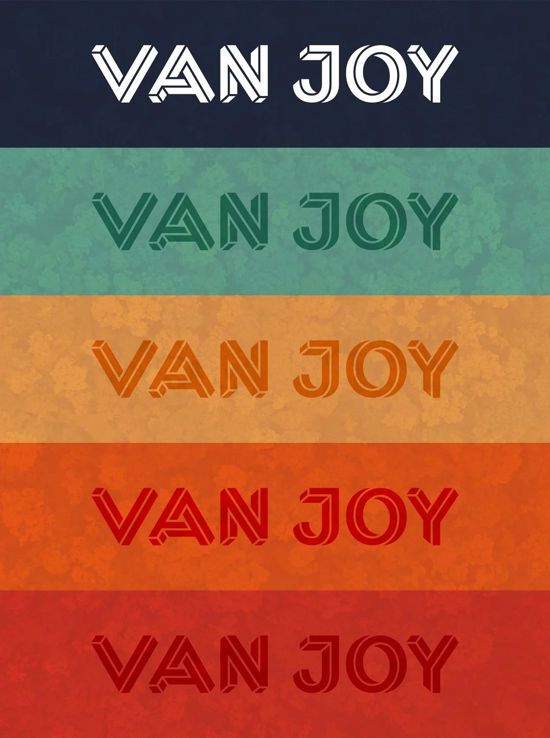
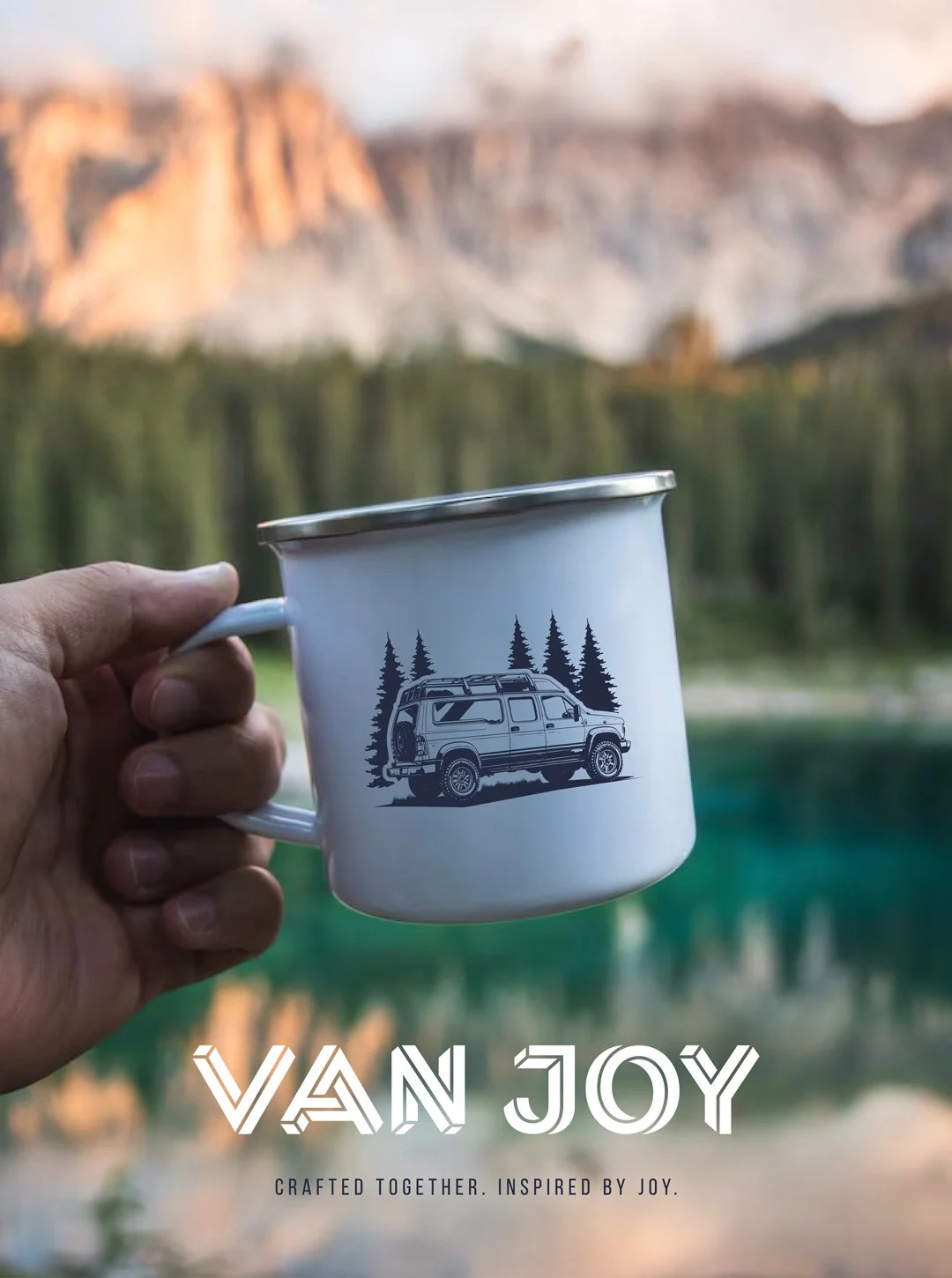
Van Joy PNW
Van Joy PNW builds custom camper vans designed for adventure in the Pacific Northwest and beyond. What began as a personal need for a more capable basecamp evolved into a craft-driven business rooted in collaboration, quality, and joy.
Van Joy specializes in custom vehicle outfitting for vans, trucks, and trailers, with handcrafted four-season interiors designed for comfort, durability, and exploration.
Brand Identity Development
|
Client Management
|
Creative Direction
|
Web Development
|
Marketing Materials
|
Digital Marketing
Brand Identity Development | Client Management | Creative Direction | Web Development | Marketing Materials | Digital Marketing
The Process
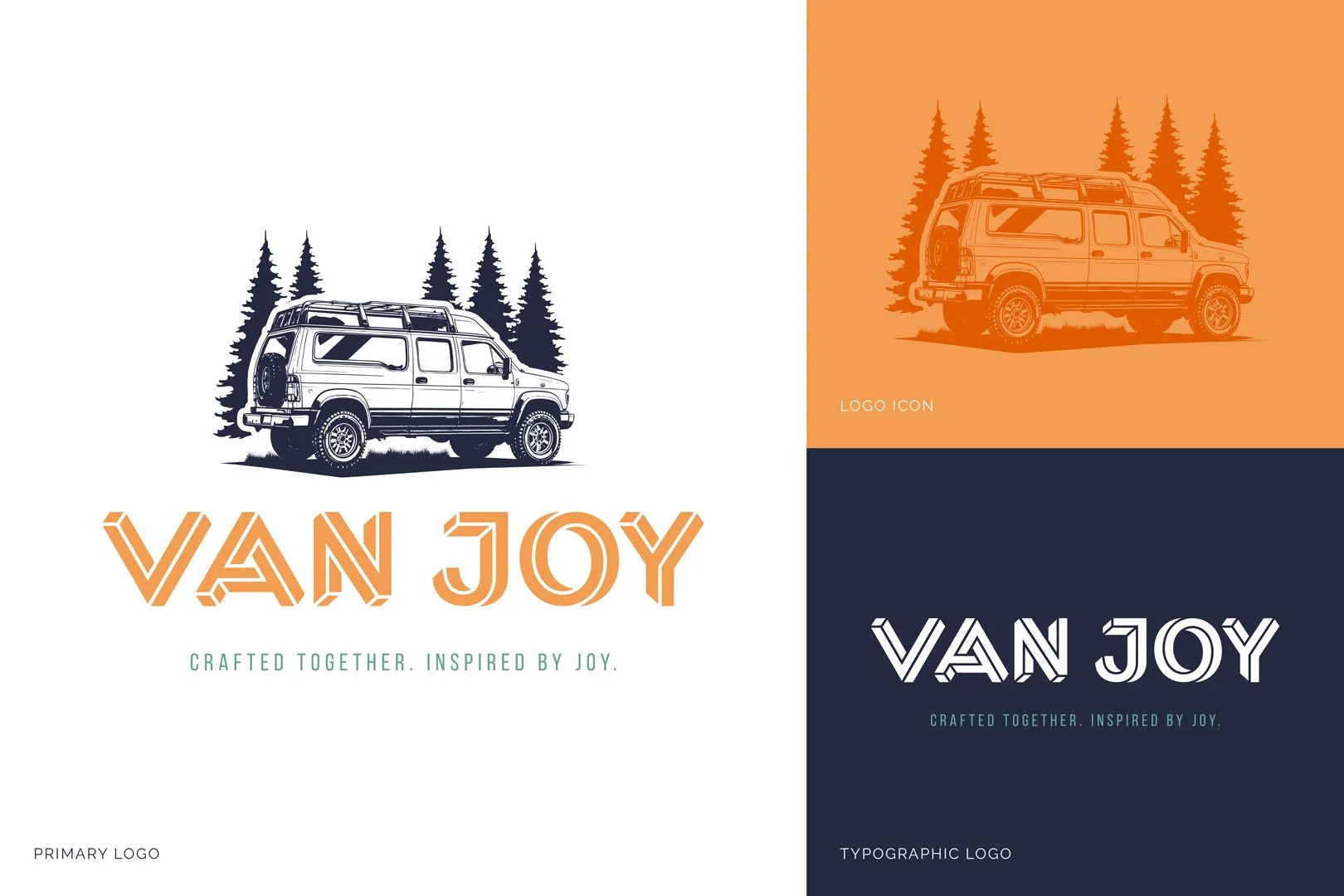
I began by touring the shop, experiencing the first build firsthand, and understanding the craftsmanship and passion behind the work. From there, I led a discovery process designed to uncover their vision, audience, and long-term aspirations.
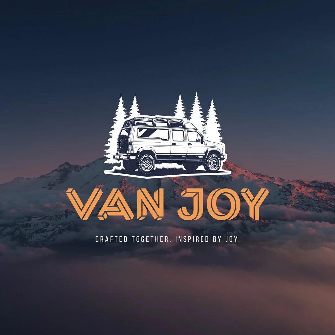
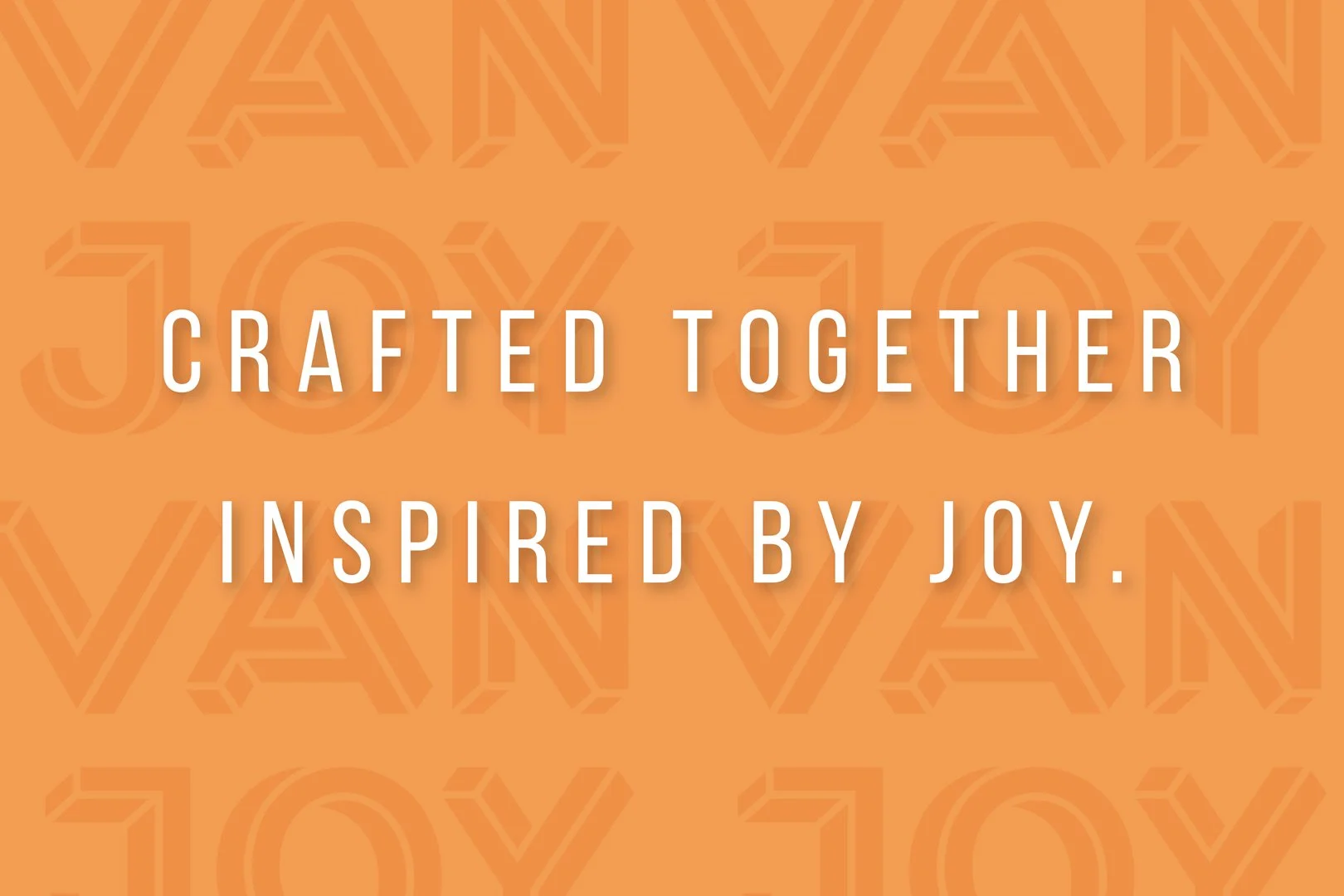
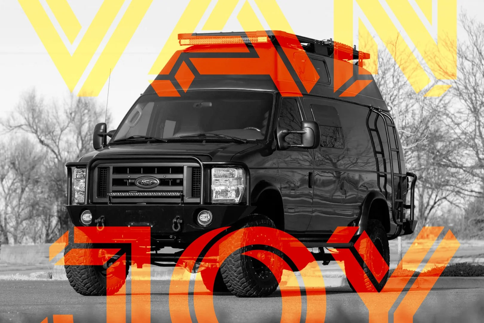
Through competitive analysis, inspiration gathering, and strategic positioning, I developed a visual system that reflects the same authenticity and care embedded in their builds. The brand balances rugged capability with refined craftsmanship — aligning directly with the Pacific Northwest adventure demographic.
The Next Steps
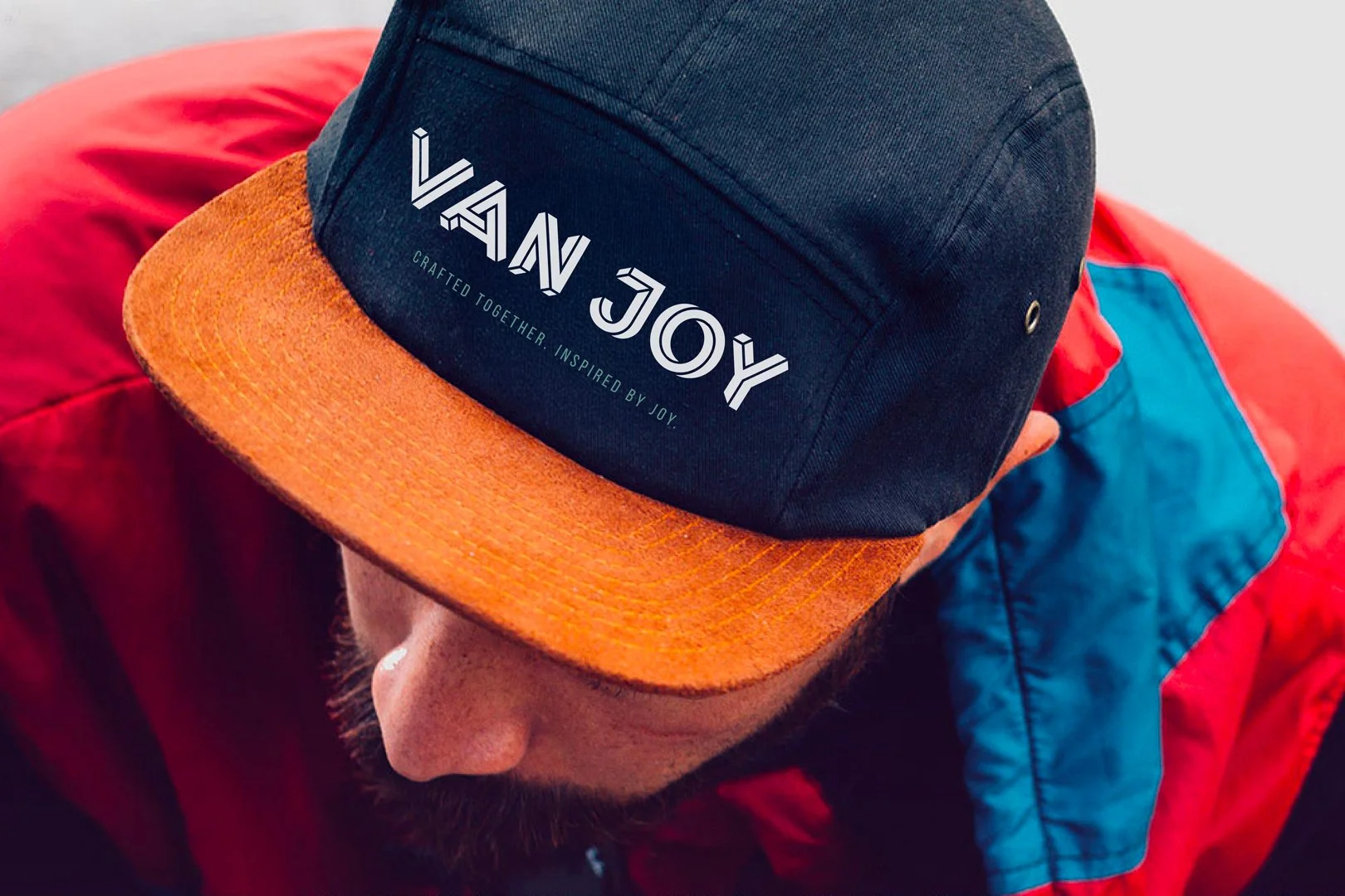
As an early-stage company, scalability was a key consideration. The brand system was built to grow — supporting website development, social media templates, trade show materials, event activations, and branded merchandise.
The goal is to evolve Van Joy from a local builder into a recognized regional brand — supported by a flexible, durable identity system designed for expansion.

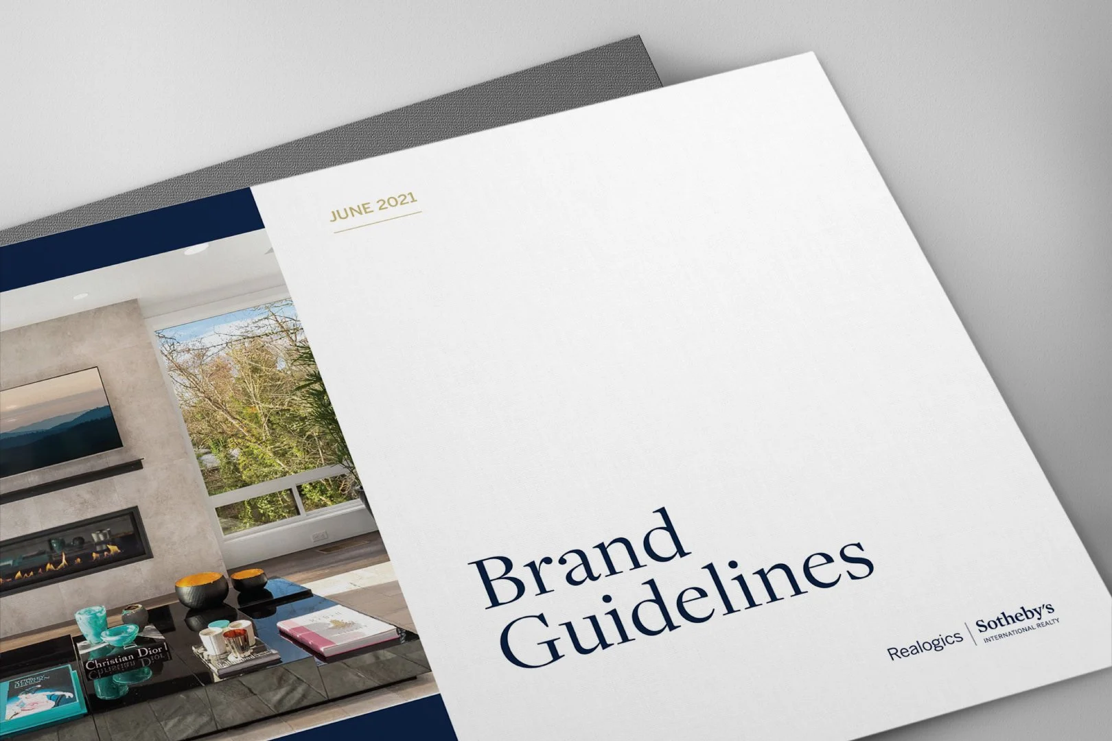
Realogics Sotheby’s International Realty
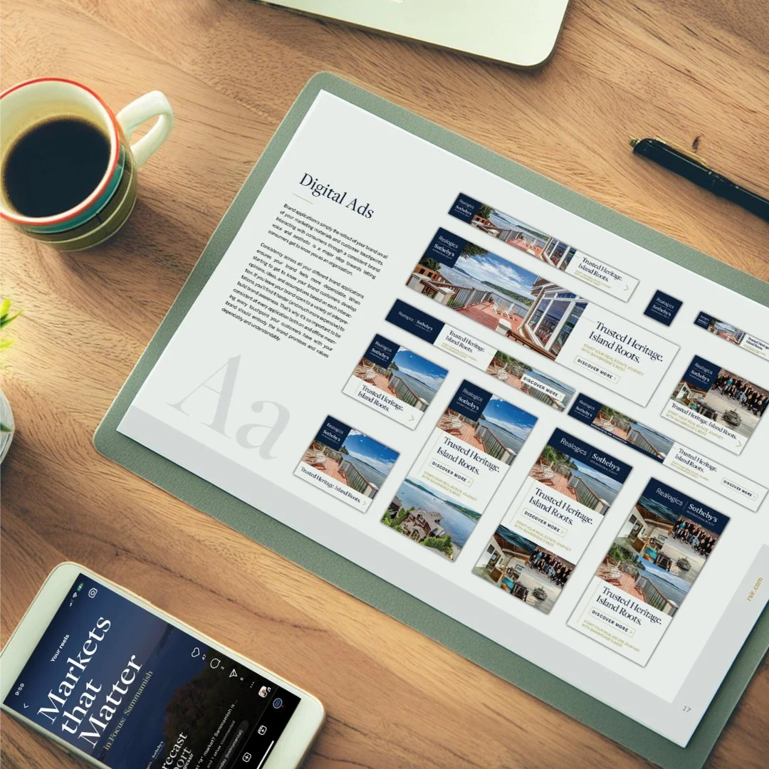
As Creative Brand Manager at Realogics Sotheby's International Realty, I led the development of a comprehensive brand guidelines system tailored specifically to the brokerage — while maintaining alignment with the global Sotheby's International Realty brand.
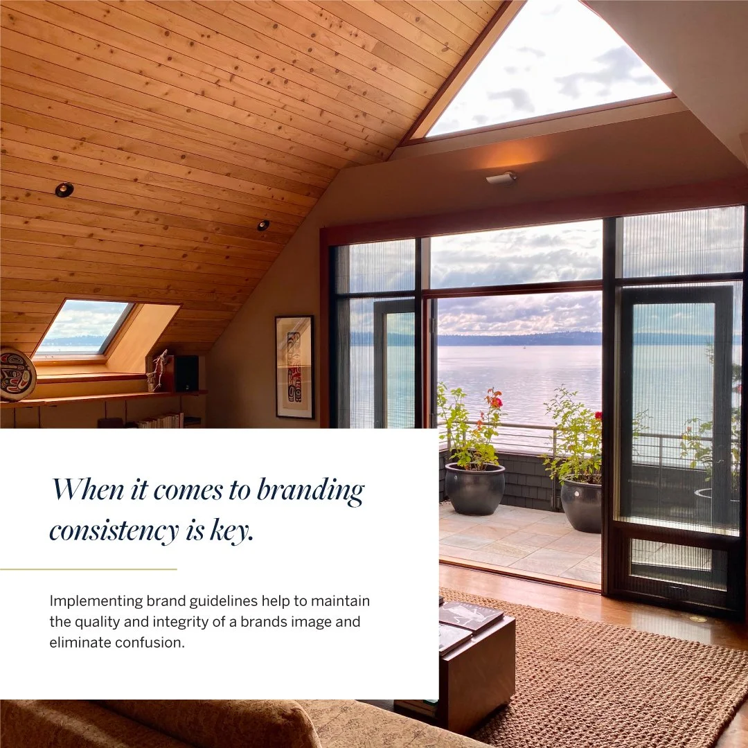
The objective was clear: empower brokers and staff with a cohesive, strategic framework that elevated brand consistency and differentiated RSIR as a marketing-first real estate firm.
Brand Guidelines Development
|
Content Creation
|
Creative Direction
|
Cross-Functional Collaboration
|
Brand Guidelines Development | Content Creation | Creative Direction | Cross-Functional Collaboration |
The Process
This initiative required deep cross-functional collaboration with executive leadership and marketing stakeholders. Together, we identified opportunities to refine aesthetic direction, modernize marketing applications, and strengthen differentiation within the Sotheby’s network.
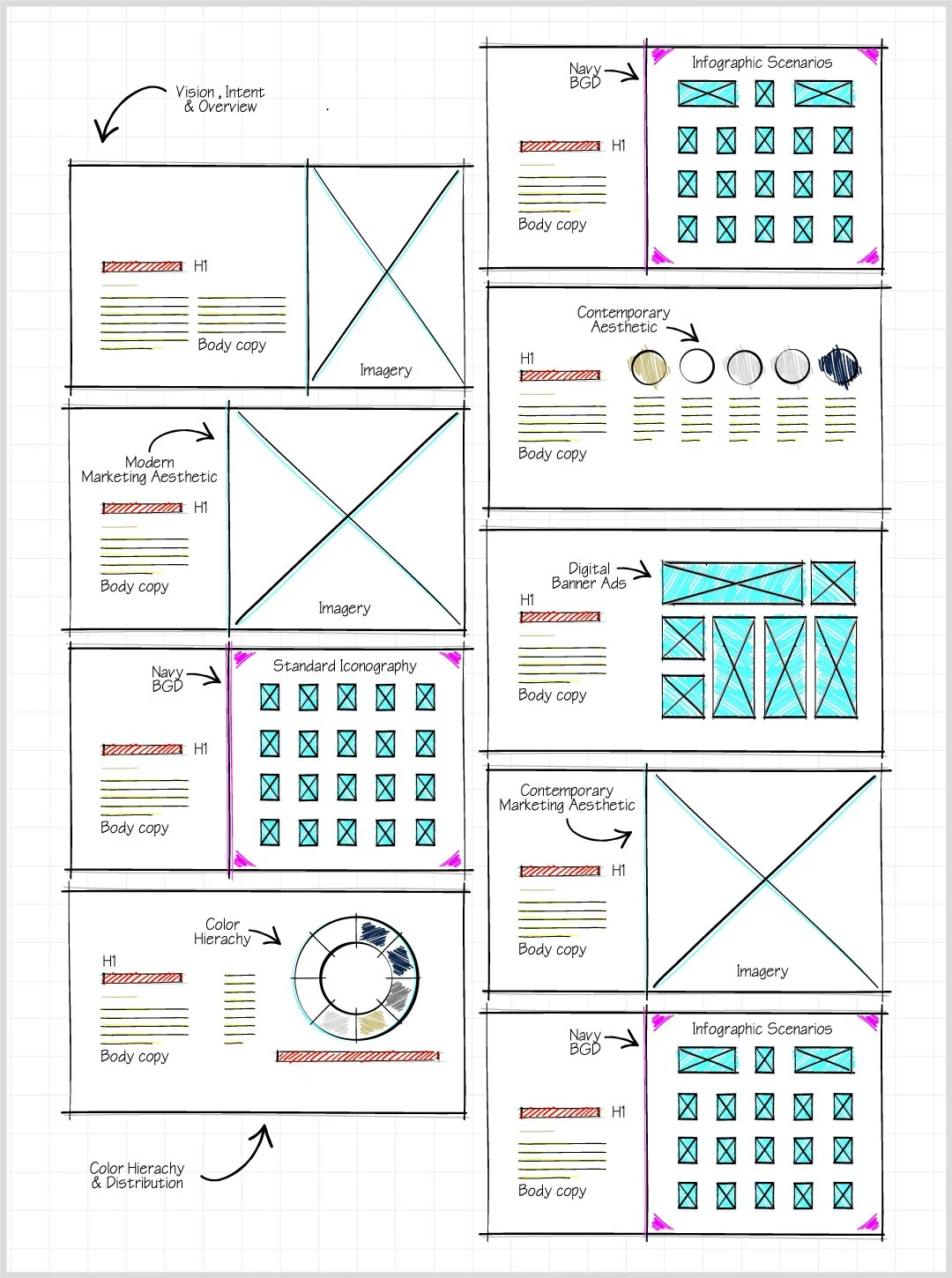
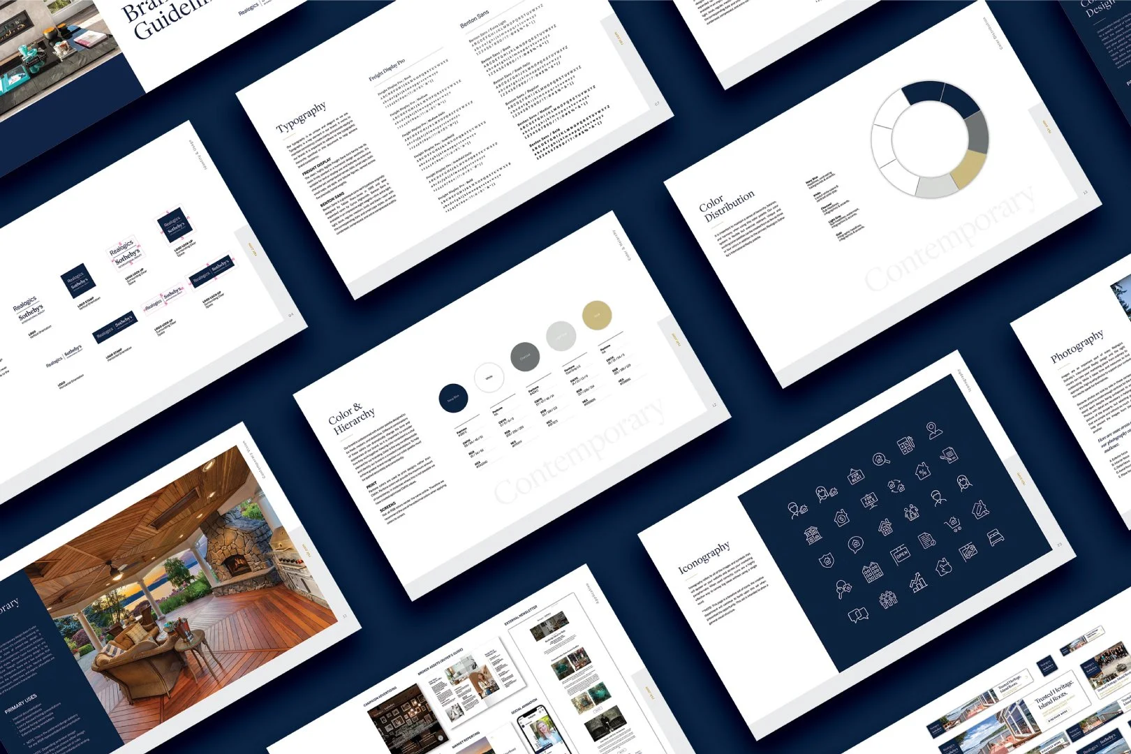
The System
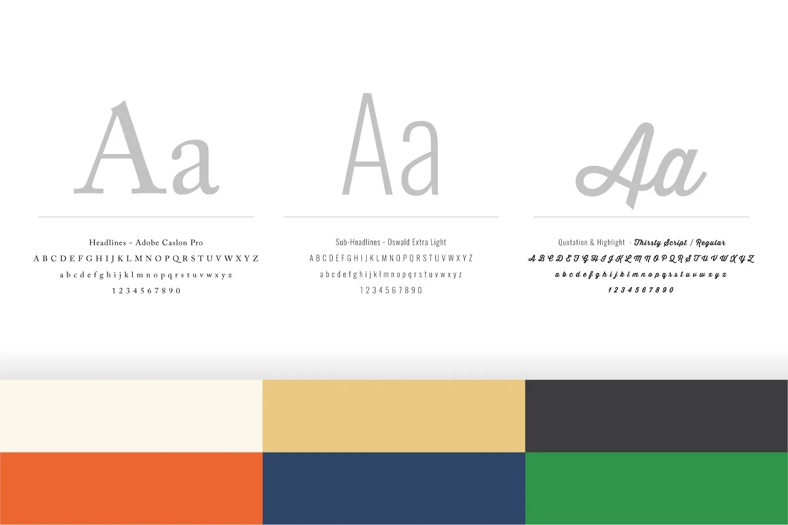
Defined typography and color systems
Logo usage and interaction standards
Iconography and infographics
Advertising wireframes
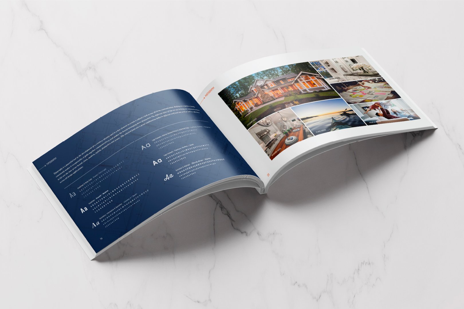
Photography and video direction
Marketing collateral applications
Every decision was made to ensure brand consistency across digital, print, and experiential touchpoints.
The Solution
The result was a comprehensive brand guidelines deck that established clear pillars, messaging frameworks, visual standards, and application examples. It now serves as the guiding document for brokers, staff, and future marketing initiatives — reviewed and refined annually to ensure long-term relevance and scalability.
Hop Social
Hop Social began as a concessions concept and evolved into a scalable brand designed for multi-market expansion. The goal was to create a trusted, adaptable food and beverage identity capable of extending from a single concession stand to full stadium restaurant environments.
Brand Identity Development
|
Concession Design & Graphics
|
Concept Presentation
|
Full-Scale Brand Build-Out
|
Brand Identity Development | Concession Design & Graphics | Concept Presentation | Full-Scale Brand Build-Out |
The Challenge
The concessions space is crowded and transactional. The challenge was to develop a differentiated brand that felt established, trustworthy, and scalable from day one.
The Solution
I built a flexible identity system rooted in bold typography, adaptable graphic elements, and modular environmental applications. The system was intentionally designed to scale — from compact concession kiosks to full-service stadium restaurants across multiple states.
The Deliverables
The brand was structured to expand seamlessly across markets while maintaining visual cohesion and operational clarity.
Core brand identity and visual system
Environmental signage and spatial graphics
Menu systems and packaging
Branded merchandise
Investor-ready concept presentations
Futurecast Forum
The Futurecast Forum is an annual thought-leadership event designed to unite industry leaders and showcase market insights, innovation, and forward-thinking strategy.
Brand Identity Development
|
Event Collateral & Wayfinding
|
Event Promotion
|
Event Presentation Template
|
Digital Marketing
|
Brand Identity Development | Event Collateral & Wayfinding | Event Promotion | Event Presentation Template | Digital Marketing |
The Process
The event began with defining strategic objectives and key themes. From there, I developed a distinct event identity that felt elevated yet aligned with the parent brand.
The Solution
The Futurecast Forum evolved into a fully developed event brand system — including visual identity, presentation templates, digital marketing assets, signage, and environmental graphics.
Importantly, the system was built to evolve annually. Each year’s iteration retains brand consistency while allowing thematic flexibility — reinforcing credibility while keeping the experience fresh and relevant.
The result is a repeatable, scalable event framework that strengthens market authority year over year.
Maybell Beauty
I was approached by Maybell Beauty at its inception to develop a brand identity rooted in its core mission: to serve as an escape from life’s daily pressures and encourage intentional self-care.
The brand was inspired by a simple but powerful idea — there is always an opportune moment to invest in yourself.
From day one, the objective was to create a cohesive, elevated identity that felt calming, aspirational, and emotionally resonant.
Brand Identity Development
|
Retail & Shop Graphics
|
Branded Merchandise
|
Digital Marketing Templates
|
Brand Identity Development | Retail & Shop Graphics | Branded Merchandise | Digital Marketing Templates |
The Challenge
In the beauty space, differentiation is often visual — but longevity requires emotional connection.
The challenge was to:
Translate a self-care mission into a distinct visual language
Build a brand that felt restorative yet refined
Create cohesion across physical and digital touchpoints
Ensure the system could scale as the company grew
The brand needed to feel intentional, immersive, and credible from launch.
The Solution
I developed a comprehensive visual identity system designed to embody calm confidence and thoughtful self-investment.
The foundation included:
A refined logo suite and typography system
A soft yet distinctive color palette aligned with the brand’s emotional tone
Retail graphics designed to reinforce a sense of escape
Branded merchandise to extend the experience beyond the storefront
Digital templates to maintain clarity and consistency online
Rather than building disconnected assets, I created a unified brand ecosystem — ensuring every touchpoint reinforced the same feeling: permission to pause, reset, and prioritize yourself.
The result is a scalable, emotionally grounded brand positioned to grow while maintaining strong visual and strategic cohesion.
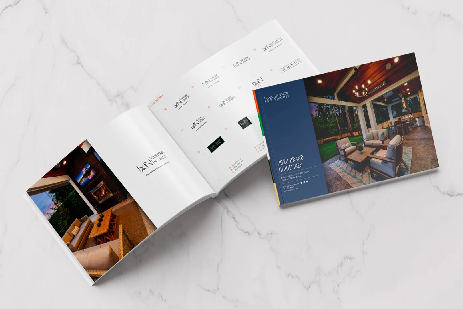
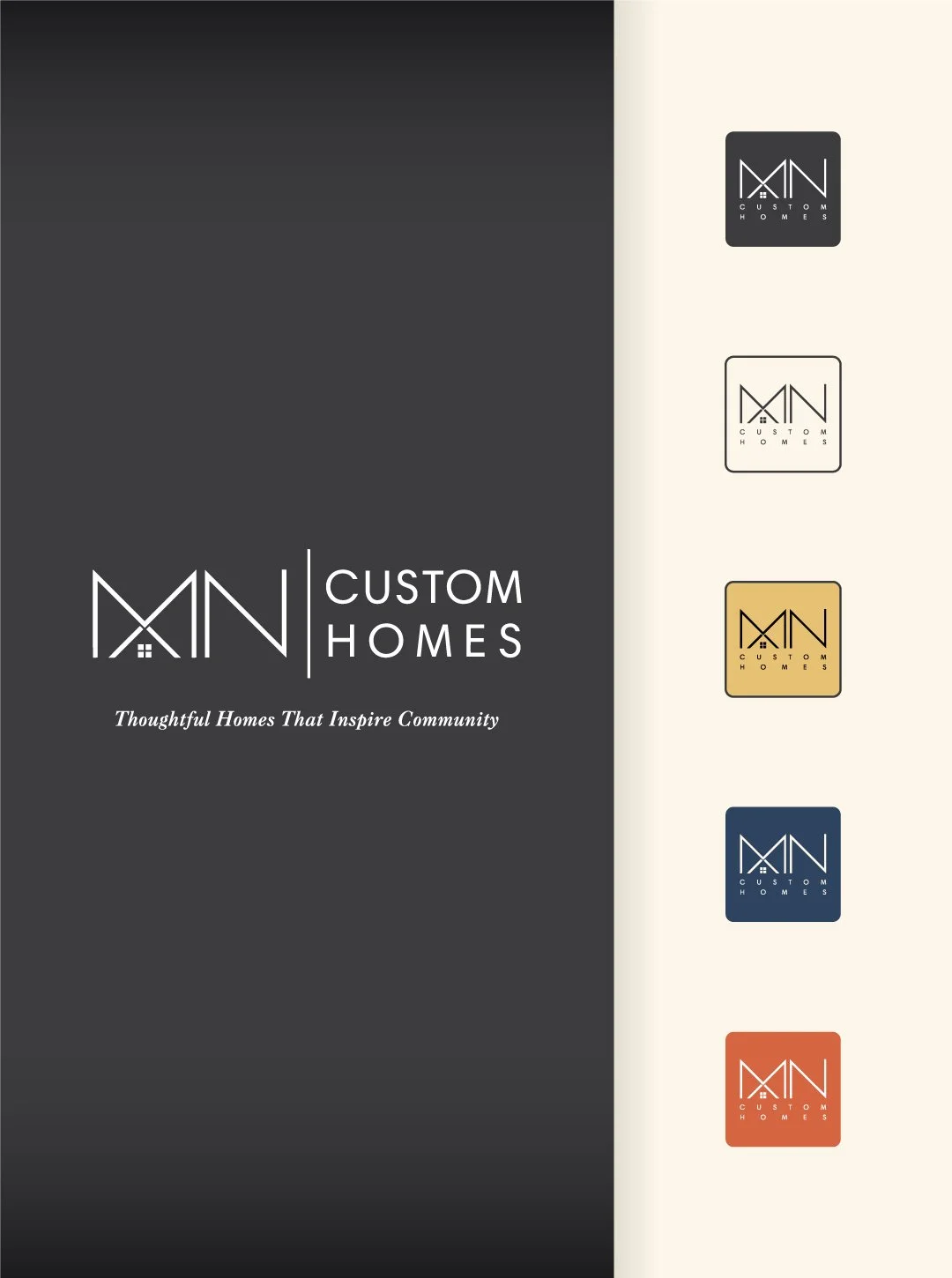
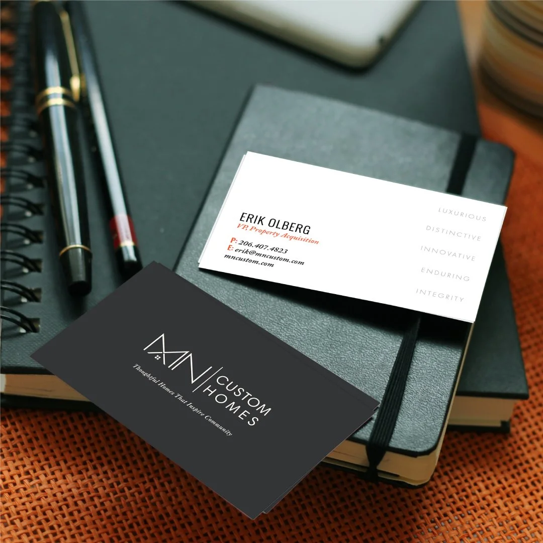
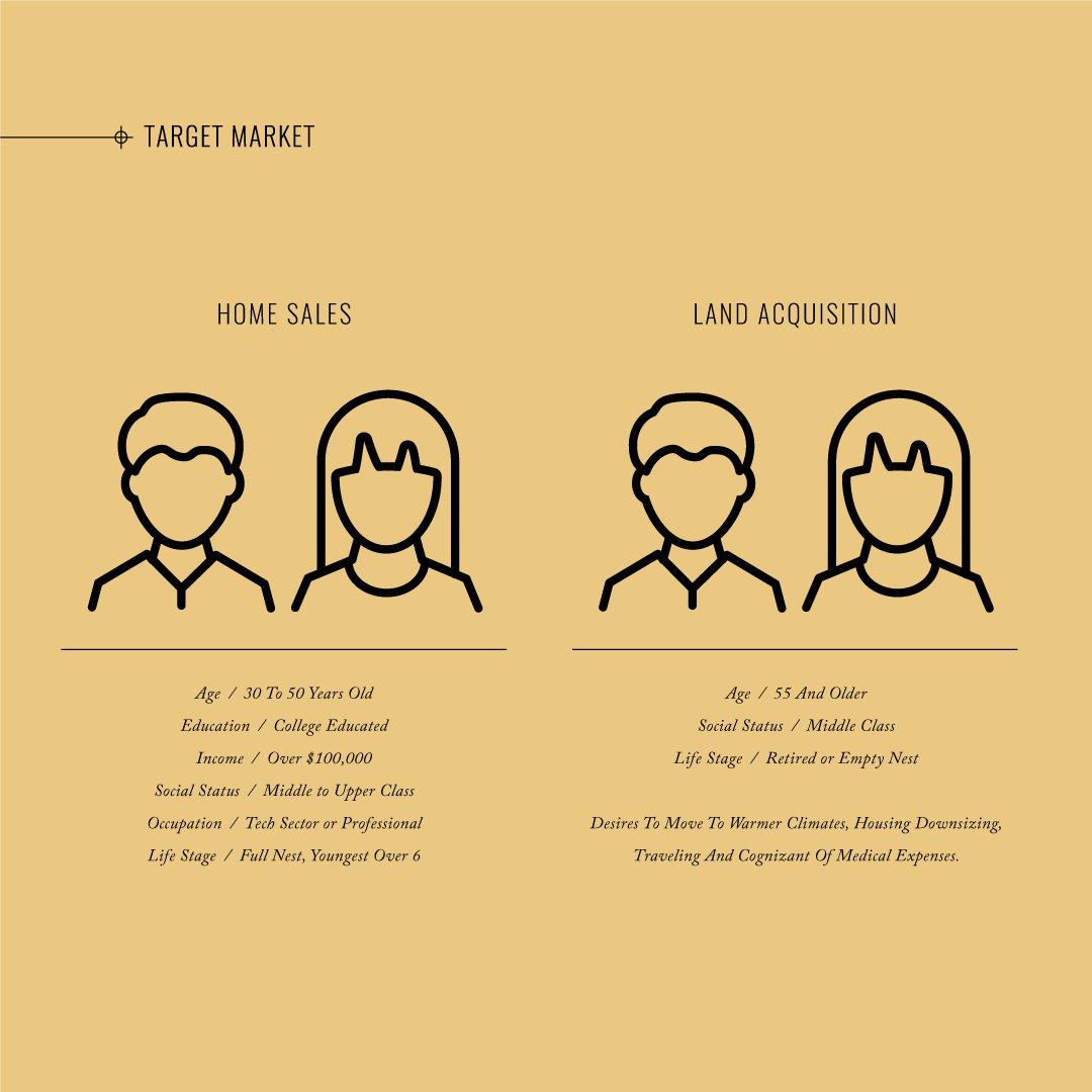
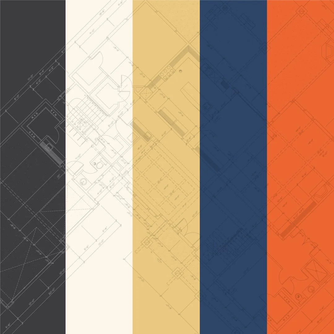
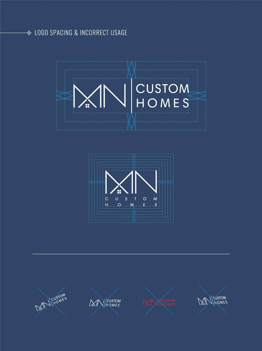
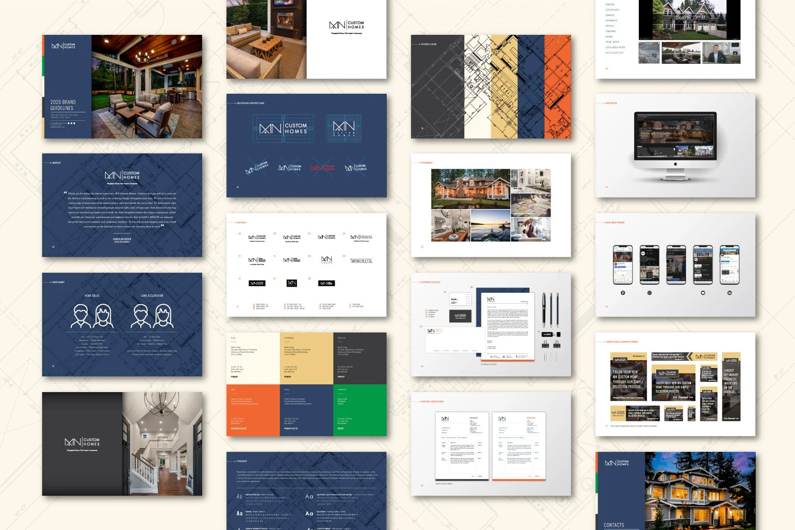
MN Custom Homes
In collaboration with leadership at MN Custom Homes, I developed a comprehensive brand guidelines manual to define and protect their identity.
Brand Guidelines Development
|
Creative Direction
|
Content Creation
|
Cross-Functional Collaboration
|
Brand Guidelines Development | Creative Direction | Content Creation | Cross-Functional Collaboration |
The Process
Working closely with leadership, we clarified the brand’s positioning and long-term vision.
We defined:
Typography and color systems
Logo usage standards
Photography direction
Advertising frameworks
The Solution
The final brand manual transformed a collection of assets into a cohesive, scalable system — ensuring consistency across marketing, digital, and print applications.
Additional Branding
I am passionate about building brands that resonate not only visually, but strategically.
Over the years, I have partnered with startups, regional businesses, and established organizations navigating growth, repositioning, and market expansion. Each engagement begins with alignment, understanding business objectives, audience insights, and long-term vision.
No two brands require the same solution. My approach is rooted in collaboration, research, and intentional design, translating strategic clarity into cohesive visual systems that support measurable growth.
Strong branding starts with listening. By engaging stakeholders early and maintaining alignment throughout the process, I ensure the final outcome is not only compelling, but purposeful and scalable.